5 Ways You’re Not Making Your Website Accessible
11 October, 2020 • ☕️ 3 min read
You think your website may look good and that it functions properly, but have you thought about accessibility? Accessibility shouldn’t be an afterthought, it should be the standard!
Here are 5 ways you’re probably not doing it right and how to fix them:
1. Not using aria-current for your highlighted navigation item
I see a lot of websites highlighting the current page the user is on inside the navigation. A great way of showing the user where they are.
However, if you’re doing this using CSS classes, a screen reader won’t be able to pick up on it.
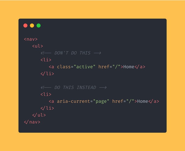
Use the ARIA-CURRENT attribute to let the screen reader know what, for example, page the user is currently on.
<nav>
   <ul>
      <!-- DON'T DO THIS -->
      <li>
         <a class="active" href="/">Home</a>
      </li>

      <!-- DO THIS INSTEAD -->
      <li>
         <a aria-current="page" href="/">Home</a>
      </li>
   </ul>
</nav>
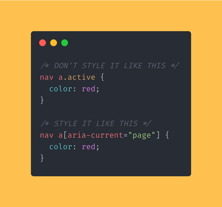
You can even use the ARIA-CURRENT selector in CSS to change the styling of the highlighted navigation element. No more “active” classes.
/* DON'T STYLE IT LIKE THIS */
nav a.active {
  color: red;
}
/* STYLE IT LIKE THIS */
nav a[aria-current="page"] {
  color: red;
}
2. Not hiding punctuation using “aria-hidden”
You may want to show a couple of links separated by a dot. Maybe in your footer or in your navigation.
A user not using a screen reader would have no trouble with this, but a screen reader will pick up this dot and read it out loud to the user.
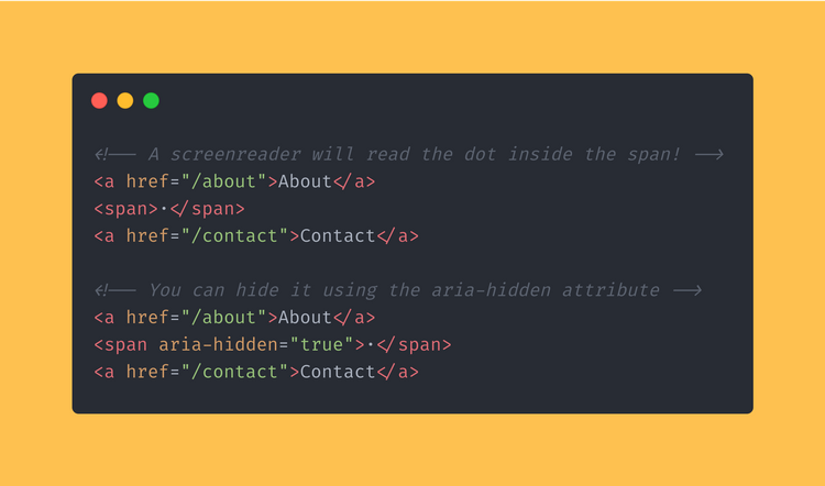
You can use the ARIA-HIDDEN attribute to hide items from the screen reader, but they will still remain visible on the screen.
<!-- A screenreader will read the dot inside the span! -->
<a href="/about">About</a>
<span>·</span>
<a href="/contact">Contact</a>

<!-- You can hide it using the aria-hidden attribute -->
<a href="/about">About</a>
<span aria-hidden="true">·</span>
<a href="/contact">Contact</a>
3. Make buttons with icons accessible
Using a button with only an icon inside it?
Maybe you’re showing a button with a cross in it to close a certain modal or pop-up.
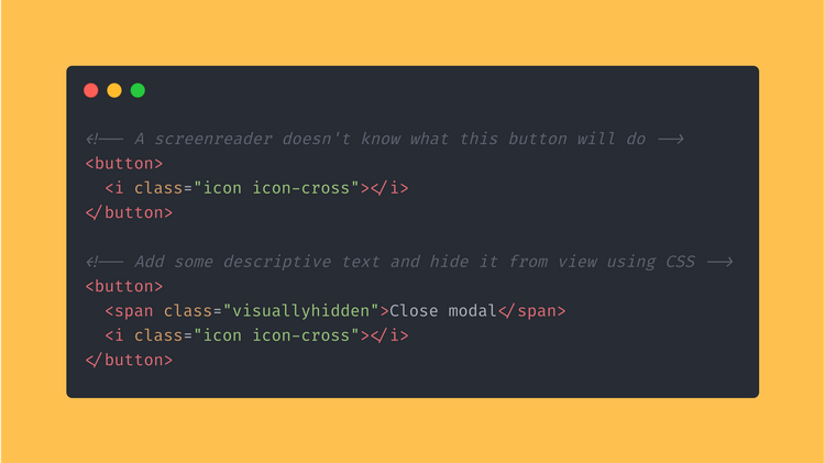
This will not be clear to a screen reader. Providing some contextual information would be a MUST for this user.
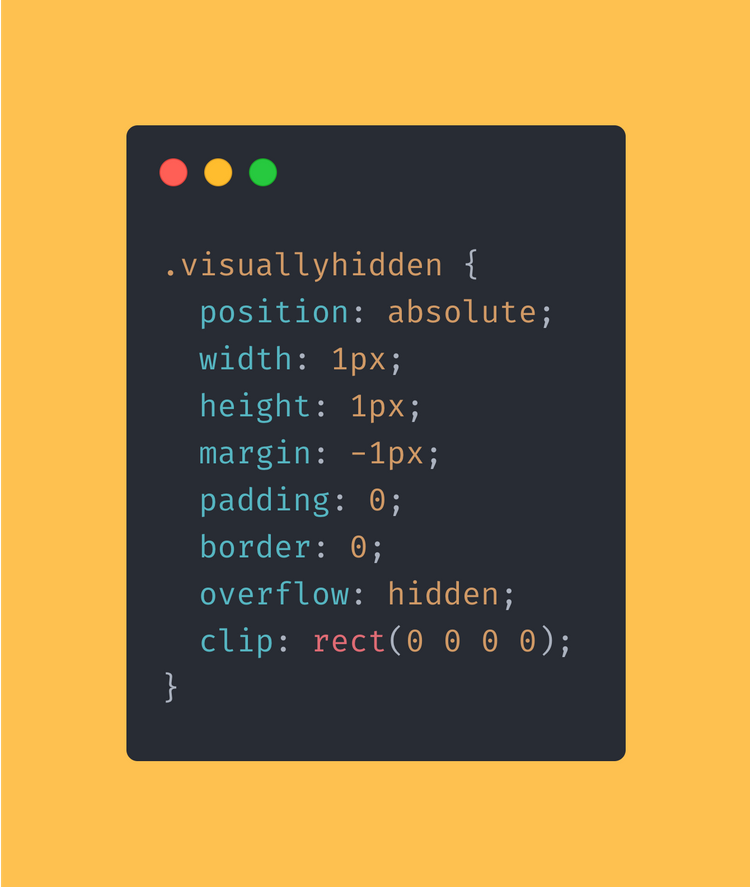
Add a span inside your button containing this descriptive text. You can then hide it using CSS.
<!-- A screenreader doesn't know what this button will do -->
<button>
  <i class="icon icon-cross"></i>
</button>

<!-- Add some descriptive text and hide it from view using CSS -->
<button>
  <span class="visuallyhidden">Close modal</span>
  <i class="icon icon-cross"></i>
</button>
The user won’t be able to see this text, but the screen reader will pick up on it and read it to the user.
.visuallyhidden {
  position: absolute;
  width: 1px;
  height: 1px;
  margin: -1px;
  padding: 0;
  border: 0;
  overflow: hidden;
  clip: rect(0 0 0 0);
}
4. IF you have to use a DIV as a button, at least make it accessible
This is something that I see happen way too much.
If you can, please use a regular BUTTON tag to create a button.
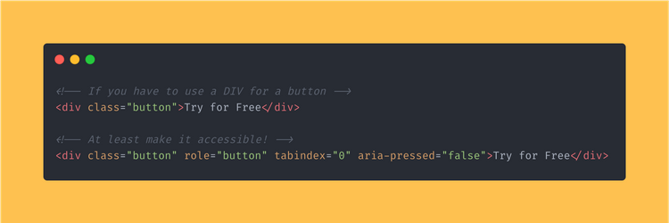
But if you have to use a DIV, please make it accessible.
Add ROLE=”BUTTON” to it to let the screen reader know that the role of the DIV is a BUTTON.
Set the TABINDEX to 0 (zero), so that the DIV can be navigated to using a keyboard.
Set the ARIA-PRESSED to FALSE so the screen reader knows that the button isn’t currently pressed.
<!-- If you have to use a DIV for a button -->
<div class="button">Try for Free</div>

<!-- At least make it accessible! -->
<div class="button" role="button" tabindex="0" aria-pressed="false">Try for Free</div>
5. PLEASE use alt text for the images you’re using
This may be an obvious one to some of you, but this is a very important point that a lot of developers forget or don’t make time for
Please write descriptive alt texts for the images you use.
The key here:
Descriptive.
I’ve seen way too many ALT=”DSC675617-07-12-2002(1).jpg”
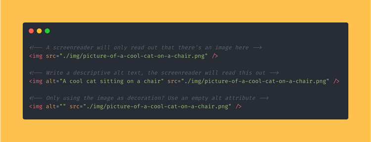
A screen reader will read the alt text out loud. Make sure that the text is as descriptive as it can be.
What is happening in the image? Is there a subject? Is it doing anything? Is there any text in the image?
<!-- A screenreader will only read out that there's an image here -->
<img src="./img/picture-of-a-cool-cat-on-a-chair.png" />

<!-- Write a descriptive alt text, the screenreader will read this out -->
<img alt="A cool cat sitting on a chair" src="./img/picture-of-a-cool-cat-on-a-chair.png" />
If you’re using an image only for aesthetic reasons, you can hide it from the screen reader by leaving the alt attribute empty.
Don’t remove the alt, just leave it empty:
<img alt="" src="./img/picture-of-a-cool-cat-on-a-chair.png" />That’s all!
Look at how much you’ve learned! I hope you will use this knowledge to make the web just a little bit better.
Want to read more about how you can improve your web-dev skills? Definitely check out “5 Must-know Javascript Tips & Tricks!
That's an Egg
Personal blog by Twan Mulder.
Making your developer life easier, one article at a time.
