Create landing pages like Stripe does
18 April, 2020 • ☕️ 2 min read
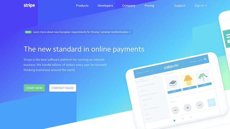
Every single time I get to open Stripes website, I can’t help but smile a little. A fast-loading, beautifully designed website which uses awe-inspiring animations and techniques to get the correct message to its users. My favourite pages include the ones about the enterprise, payments, or Sigma. There is so much you can learn from this website, and not just as a designer or developer.
Today, we’re diving into how Stripe uses small and easy-to-use CSS tricks to create a staggering website.

Instructions / follow along
So to follow along with this article you can open up your own text editor, but I also created a couple of Sandboxes for you to follow along without having to touch any code yourself.
These are the steps we will be following:
- HTML Layout
- CSS Styling
That’s all you’ll need 😄
HTML Layout
The main focus of this article will be on recreating the angled background. You see this everywhere nowadays. If you have ever used Dribbble, this’ll be your bread and butter.
So to start off, we’ll create a “block” element. We give this a pretty gradient and let it fill the entire page.
<div class="block">
</div>
Easy.
Inside this “block”, we’ll be putting 4 elements(spans), which will be the solid coloured blocks you can find spread around the page.
<div class="block">
   <span></span>
   <span></span>
   <span></span>
   <span></span>
</div>
On top of this background block, a text element is created which contains our headline, and just below that a small sentence.
<div class="block">
   ...
</div>

<div class="text">
   <h1>The new standard in online payments</h1>
   <p> Stripe is the best software platform for running an internet business. We handle billions of dollars every year for forward-thinking businesses around the world.
   </p>
</div>
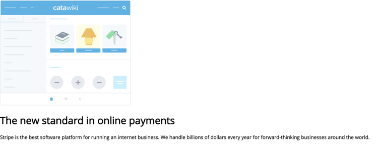
Now that we’ve got out text, the only thing left will be the image. I’ve kindly ripped it off their own website, and added it inside our HTML.
<div class="block">
   ...
</div>

<div class="img-wrapper">
   <img src="https://stripe.com/img/v3/home/app-illustrations/catawiki.svg"/>
</div>

<div class="text">
   ...
</div>
That’s all for the HTML! We’ve created our background, a text element, and an image. Now let’s get to styling 😄

CSS Styling
Making it pretty
First, the styling of our background. It will fill the entire width of the screen, its height will be 760px, it gets a pretty background gradient and we’ll set it’s positioning to absolute.
.block {
   width: 100%;
   height: 760px;
   background: linear-gradient(150deg, #53f 15%, #05d5ff 70%, #a6ffcb 94%);
   position: absolute;
   top: 0;
}
Next, we’ll get to the spans inside the “block” element. Every span gets a height of 190px and an absolute positioning.
.block span {
   height: 190px;
   position: absolute;
}
To style each block differently, we can use the “:nth-child()” selector. Adding some color, and setting its position is all we’ll need. We do this step for every single one of the four “children”.
.block span:nth-child(4) { /* Select the 4th span inside .block */
   width: 33.33333%;
   bottom: 0;
   background: #1fa2ff;
}
Great! Finally, we skew the entire background on its Y-axis. This way, we’ll get the classic skewed header look.
.block{
   ...
   transform: skewY(-12deg);
   transform-origin: 0;
}
And we did it! Using some simple styling on our text and image, we now have a partly recreated replica of Stripes homepage.
Of course, this is just the beginning of creating a simple homepage. What we did find out here, is how easy it is to use the skew method inside CSS to manipulate our background instead of creating multiple images/SVGs for different breakpoints.
Thank you for reading!
That's an Egg
Personal blog by Twan Mulder.
Making your developer life easier, one article at a time.
