Create your own Dark Mode using JS, CSS Variables, and localStorage
18 December, 2020 • ☕️ 3 min read
Dark Mode
Either you use it as when and wherever you can, or you don’t use it at all.
Giving your users a way to customise their experience on your website is a huge win for user experience.
In this article, I’ll guide you through how to create your very own using CSS Variables, some basic JavaScript, and the use of localStorage!
Follow along
So to follow along with this article you can open up your own text editor, but I also created a couple of Sandboxes for you to follow along without having to touch any code yourself.
These are the steps we will be following:
- Creating our CSS Variables
- Adding the Theme Toggle Switch
- Writing the JS logic
That’s all you’ll need 😄
If you don’t have a website of your own to which you wish to add this functionality, use this demo website to follow along.
Creating our CSS Variables
We will be using CSS Custom Properties, better known as CSS Variables, which we can reference and modify in our CSS file.
I recently wrote an article that goes in-depth on what they exactly are and what some do’s and don’t are. If you want to read more about CSS Variables, you can check it out over here.
CSS Variables (or CSS Custom Properties) are entities defined by CSS authors that contain specific values to be reused throughout a document. They are set using custom property notation (e.g., — main-color: black;) and are accessed using the var() function (e.g., color: var( — main-color);)
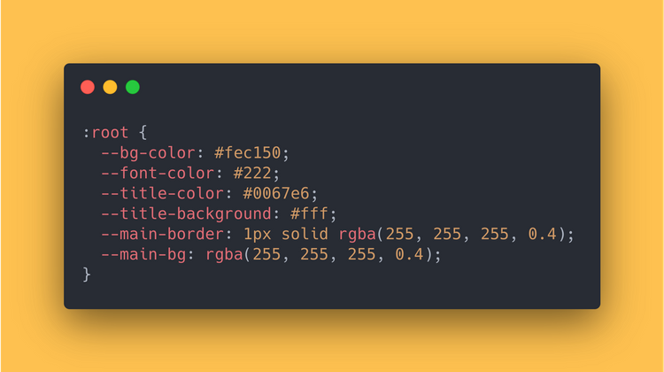
Starting, we’ll add the CSS Variables for our default/light mode. We can add these to the :root pseudo class.
:root is a pseudo-class that matches <html>. Actually, it’s exactly the same as if we had used html in place of :root (except it has higher specificity).
:root {
  --bg-color: #fec150;
  --font-color: #222;
  --title-color: #0067e6;
  --title-background: #fff;
  --main-border: 1px solid rgba(255, 255, 255, 0.4);
  --main-bg: rgba(255, 255, 255, 0.4);
}
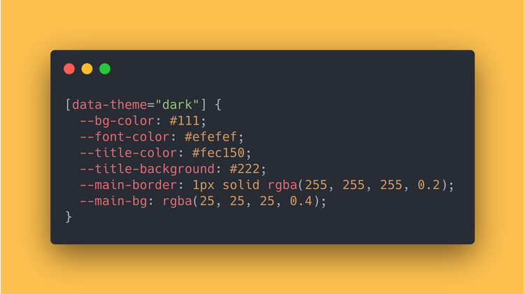
Then, we’ll add the CSS Variables for our dark mode.
[data-theme="dark"] {
  --bg-color: #111;
  --font-color: #efefef;
  --title-color: #fec150;
  --title-background: #222;
  --main-border: 1px solid rgba(255, 255, 255, 0.2);
  --main-bg: rgba(25, 25, 25, 0.4);
}
What is [data-theme="dark"]? This means we are referencing to a data attribute which is called data-theme. When it is set to “dark”, the default/light CSS Variables will be replaced by the dark mode variables.
Using the CSS Variables
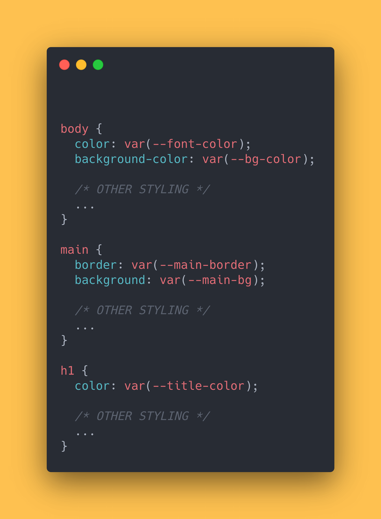
Now that we’ve created our CSS Variables, we can use them in our CSS file to style our elements:
body {
  color: var(--font-color);
  background-color: var(--bg-color);
/* OTHER STYLING */
  ...
}
main {
  border: var(--main-border);
  background: var(--main-bg);
/* OTHER STYLING */
  ...
}
h1 {
  color: var(--title-color);
/* OTHER STYLING */
  ...
}
Adding the Theme Toggle Switch
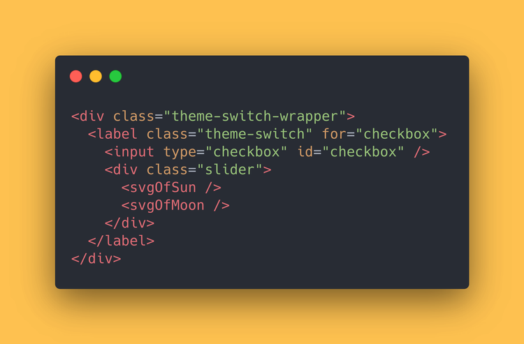
The toggle we’ll be building is mainly just a checkbox. We will add some custom styling and icons to make it a bit more attractive!
The icons are from feathericons.com. I’ve left them out of the code here, but you can download them from their website or copy them from the Sandbox.
<div class="theme-switch-wrapper">
  <label class="theme-switch" for="checkbox">
    <input type="checkbox" id="checkbox" />
    <div class="slider">
      <svgOfSun />
      <svgOfMoon />
    </div>
  </label>
</div>
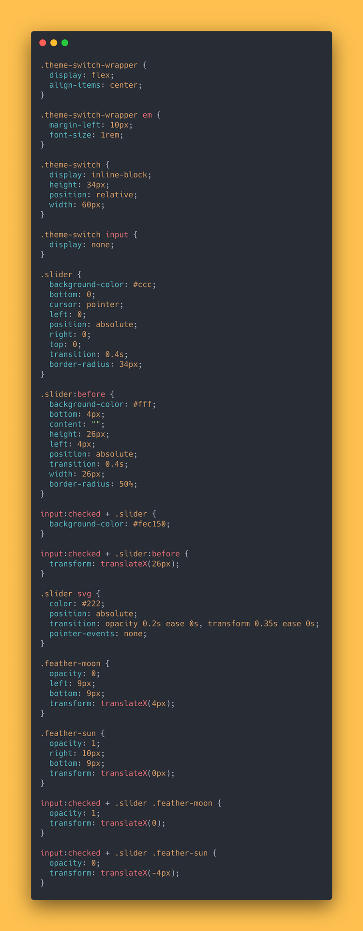
And here is the CSS (it’s quite a lot):
.theme-switch-wrapper {
  display: flex;
  align-items: center;
}
.theme-switch-wrapper em {
  margin-left: 10px;
  font-size: 1rem;
}
.theme-switch {
  display: inline-block;
  height: 34px;
  position: relative;
  width: 60px;
}
.theme-switch input {
  display: none;
}
.slider {
  background-color: #ccc;
  bottom: 0;
  cursor: pointer;
  left: 0;
  position: absolute;
  right: 0;
  top: 0;
  transition: 0.4s;
  border-radius: 34px;
}
.slider:before {
  background-color: #fff;
  bottom: 4px;
  content: "";
  height: 26px;
  left: 4px;
  position: absolute;
  transition: 0.4s;
  width: 26px;
  border-radius: 50%;
}
input:checked + .slider {
  background-color: #fec150;
}
input:checked + .slider:before {
  transform: translateX(26px);
}
.slider svg {
  color: #222;
  position: absolute;
  transition: opacity 0.2s ease 0s, transform 0.35s ease 0s;
  pointer-events: none;
}
.feather-moon {
  opacity: 0;
  left: 9px;
  bottom: 9px;
  transform: translateX(4px);
}
.feather-sun {
  opacity: 1;
  right: 10px;
  bottom: 9px;
  transform: translateX(0px);
}
input:checked + .slider .feather-moon {
  opacity: 1;
  transform: translateX(0);
}
input:checked + .slider .feather-sun {
  opacity: 0;
  transform: translateX(-4px);
}
Writing the JS logic
Now for the final part.
Using JavaScript, we’ll make this button toggle the light/dark mode, which will update the colors of our website.
We can split writing our JS up in 3 features:
- Add event handlers to handle accordingly the check/uncheck event of toggle-switch
- Store the user preference for future visits
- Check for saved user preference, if any, on load of the website
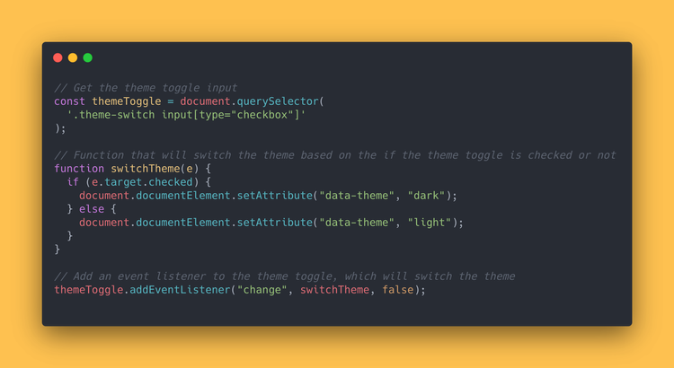
Adding the event handlers
// Get the theme toggle input
const themeToggle = document.querySelector(
  '.theme-switch input[type="checkbox"]'
);
// Function that will switch the theme based on the if the theme toggle is checked or not
function switchTheme(e) {
  if (e.target.checked) {
    document.documentElement.setAttribute("data-theme", "dark");
  } else {
    document.documentElement.setAttribute("data-theme", "light");
  }
}
// Add an event listener to the theme toggle, which will switch the theme
themeToggle.addEventListener("change", switchTheme, false);
By switching the [data-theme="dark"] attribute on our root element, we can change which CSS Variables will be used on the website.
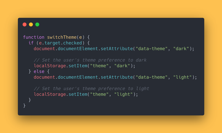
Store the user preference for future visits
We can use a browser’s localStorage to store anything! It’s a great place to store a user’s light/dark mode preference.
Let’s update our switchTheme function:
function switchTheme(e) {
  if (e.target.checked) {
    document.documentElement.setAttribute("data-theme", "dark");

    // Set the user's theme preference to dark
    localStorage.setItem("theme", "dark");
  } else {
    document.documentElement.setAttribute("data-theme", "light");

    // Set the user's theme preference to light
    localStorage.setItem("theme", "light");
  }
}
Check for saved user preference, if any, on load of the website
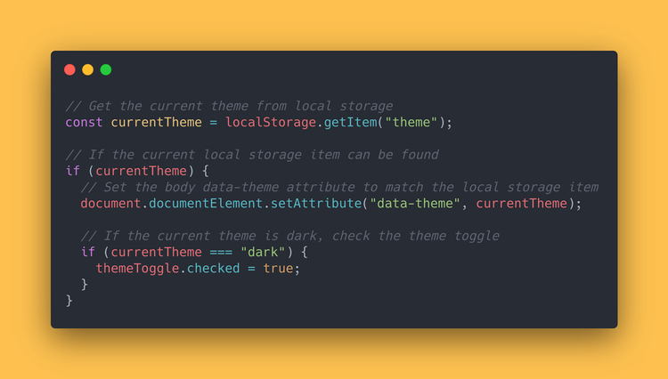
Now, on initial load of the website, we can check if a theme preference is already available in the localStorage of the browser.
If it is, we can update our our root element accordingly.
We’ll set the correct data-theme attribute and check/uncheck our theme toggle.
// Get the current theme from local storage
const currentTheme = localStorage.getItem("theme");
// If the current local storage item can be found
if (currentTheme) {
  // Set the body data-theme attribute to match the local storage item
  document.documentElement.setAttribute("data-theme", currentTheme);
// If the current theme is dark, check the theme toggle
  if (currentTheme === "dark") {
    themeToggle.checked = true;
  }
}
And there we go! A fully functioning light/dark mode using CSS Variables, some basic JavaScript and localStorage.
You can check out the fully working demo right here:
I’ve also added this feature to my website recently, so you can check it out in the navigation!
Thank you so much for reading. For a little more in-depth knowledge on CSS Variables, definitely check out the MDN spec for them.
If you like reading about JavaScript and web-development, you can read about “What’s the difference between Event Handlers & addEventListener in JS?” or “10 JavaScript One-liners You Have Got to Add Your Arsenal as a Developer”.
Have a nice day! 😄
That's an Egg
Personal blog by Twan Mulder.
Making your developer life easier, one article at a time.
